Random Walk Down Nasdaq Highs
Practice applying Auction Market Principles
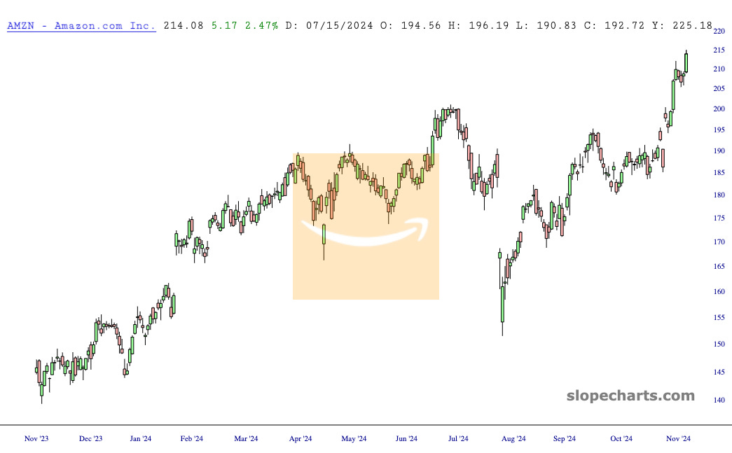
9 out of these 15 are brand new to my eyes. I simply overlayed rough balance areas. You can actually see the migration of the auction participants higher (in this case since these are all making new yearly highs.)
Here are three untouched.
AMZN
NFLX
DOCU
And one more BTC, throwing this in as an intraday chart so you can see it work on multiple time frames. Just note the shorter the time frame the less credence or efficacy.
Pro tip: If you squint, you may start to see the auction and market profile without any aid.
Below are quick illustrations of buyers and sellers moving up and down agreeing on new areas of time and price to facilitate trade.
After a while, you are going to begin seeing these in all time frames without needing to draw a thing. The most important component though, is understanding what is going on structurally underneath the hood. Why does this keep repeating?


