
P&F Charts Friendsgiving (Point & Figure)
Bonus! 100 Quality Companies from Bill Cara's Navigator PDF Download
I actually prefer Market Profile charts. But sometimes I enjoy P&F a lot as well.
First let’s define P&F Charts
A point and figure (P&F) chart is a technical analysis tool that plots price movements without using a time axis, focusing solely on price changes to filter out minor fluctuations and identify trends. It uses columns of “X”s for rising prices and “O”s for falling prices, adding new X’s or O’s only when the price moves a specific, predefined amount (the “box size”) in one direction. A new column is started when the price reverses by a certain amount (the “reversal amount”), which helps to smooth out price action and identify support/resistance levels and breakouts.
How are P&F charts different from Market Profile charts?
P&F (Point and Figure) and Market Profile charts are both technical analysis tools, but they focus on different aspects of trading: P&F charts ignore time to focus solely on price movements using 'X's and 'O's to identify trends and support/resistance levels, while Market Profile charts focus on the time at which trades occur to show how price distribution forms over time. A key difference is that P&F charts are time-agnostic, while Market Profile charts are time-dependent, visualizing price activity within specific trading sessions.
You can bookmark this page to search p&f charts for free here. Stockcharts.com
What good looks like
LLY

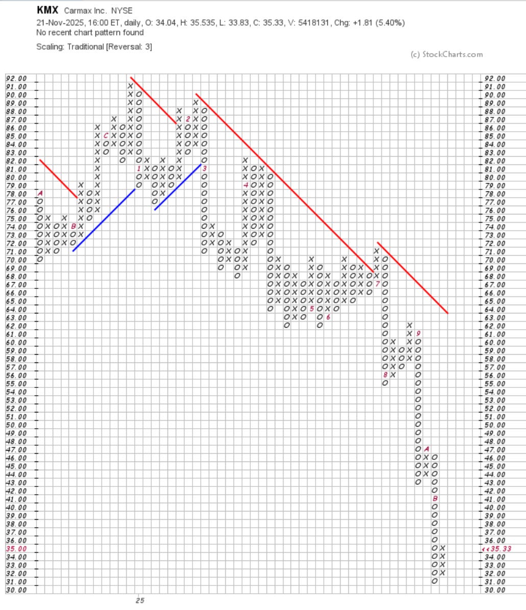
What bad looks like
KMX
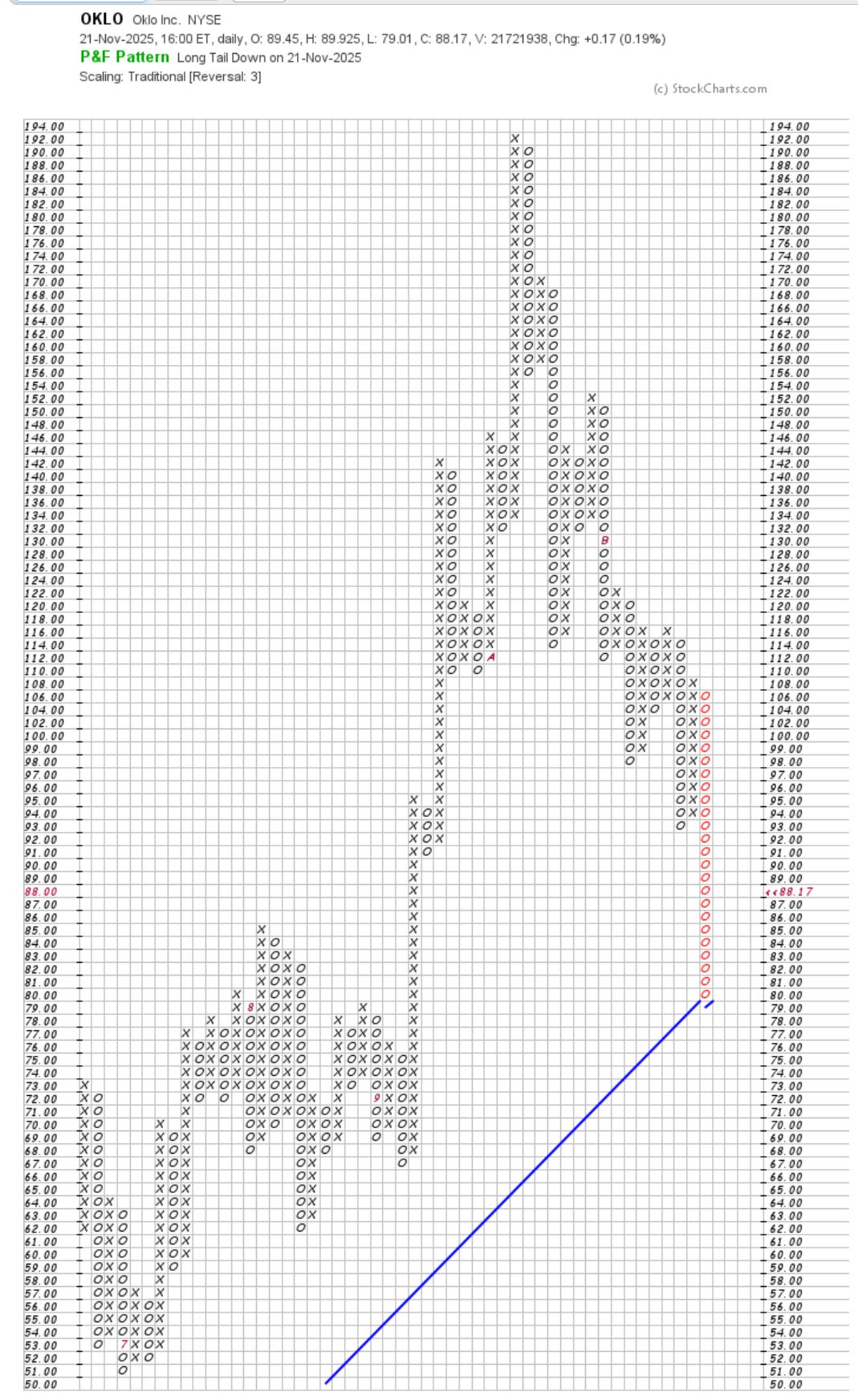
OKLO
Now that we set the Friendsgiving table, lets go feast on some P&F charts