
Market Profile Charting for Dummies - Remastered
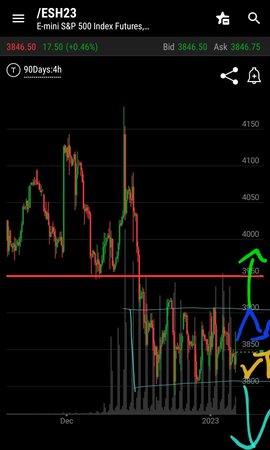
This article was lost this summer by my fat finger and I would like to share it again. But a quick glance at S&P futures for the past few weeks serves as a perfect example of the lesson I am sharing. This 1st chart is from 8:35am premarket.
(Originally shared May 1, 2022)

Prices of anything have only three phases. "No it is not up vs down. Those are simply by products of below:
In Balance
Seeking a new balance area
Random chop
That is it. Whether you are talking about groceries, Air Jordans, Porsche GT3 w/manual, homes, stocks, or bonds.
Market profile charts display price, volume, and time frame on a single chart, indicating the value areas and points of control for a stock.
It emphasizes price location and the time spent there. This is unique way to look at price as we all trade price, not time.
A typical Market Profile chart looks like this: